Pantone’s Colour of the Year 2022 : Very Peri
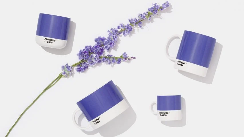
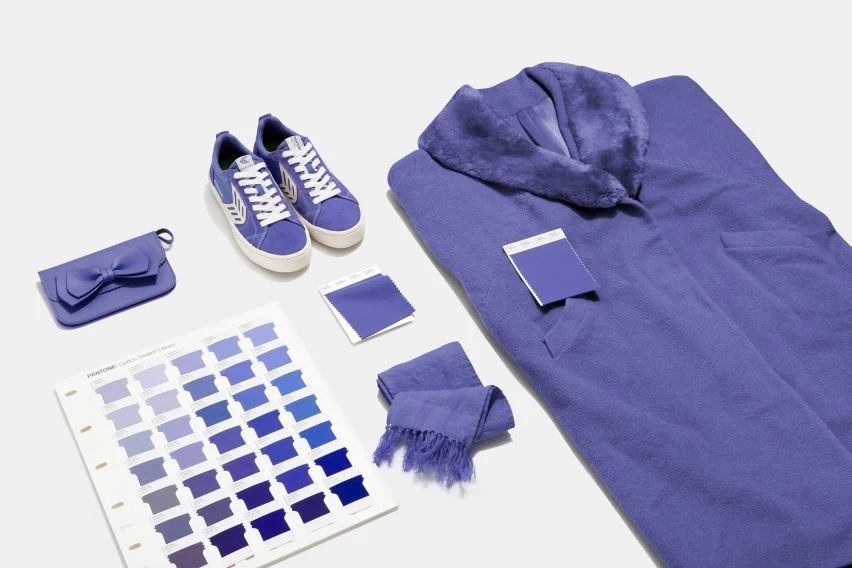
Every year the design industry wait in anticipation for the colour of year to be announced by Pantone, and this year feels very special indeed. Not only has it been heralded as the ‘It’ colour for 2022, but Very Peri is in fact a brand new colour created by Pantone for the first time ever in the history of its Colour of the Year forecasts.
Transformative Times
‘We are living in transformative times,’ say Pantone. ‘Very Peri is a symbol of the global zeitgeist of the moment and the transition we are going through. As we emerge from an intense period of isolation, our notions and standards are changing, and our physical and digital lives have merged in new ways.’
Encouraging personal inventiveness and creativity, Pantone describe Very Peri as a ‘dynamic periwinkle blue hue with a vivifying violet red undertone’.
Promoting Happiness and Positivity
Very Peri has been described as ‘the happiest and warmest of all the blue hues’. With the challenges faced by everyone over the past couple of years, we think that anything that promotes happiness and positivity can only be a good thing.
In the home, Very Peri add fun and a sense of lightness to spaces, working well with both dark and light colour palettes. This versatile shade is suited to different materials, textures and finishes.
Versital has two ideal options that work perfectly with Pantone’s Very Peri:
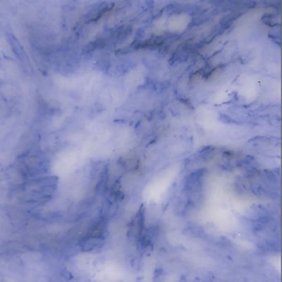
Penthouse
A beautiful bold lavender marble with swirls of veins throughout.
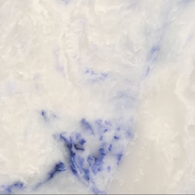
Perlato Penthouse
A subtle off white classic marble with a nod to Veri Peri with veins of lavender swirled throughout.
Home Decor
For the home opt for Versital in the bathroom by using it for vanity tops or even bathroom wall panels. If you’re brave enough go all out with Penthouse, but for a more subtle nod Perlato Penthouse is ideal. Pair with whites, darks or for real impact clash with Pinks and Mustards.
Veri Peri in Hospitality
Go bold with beautiful prints from Bobo 1325 with prints like ‘That’s the tea’ and ‘Blackmountain Brecon’. Available in both wallpapers and fabrics they make a real statement to walls or seating and soft furnishings.
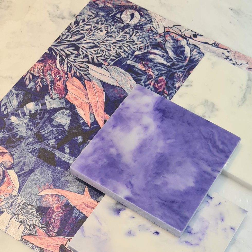
Pair with bar tops and table tops from Versital to complete the look.
A World of unprecedented change
“As we move into a world of unprecedented change, the selection of PANTONE 17-3938 Very Peri brings a novel perspective and vision of the trusted and beloved blue colour family.
Encompassing the qualities of the blues, yet at the same time possessing a violet-red undertone, Very Peri displays a spritely, joyous attitude and dynamic presence that encourages courageous creativity and imaginative expression.”
Executive Director Pantone Color Institute – Leatrice Eiseman
“We are always excited to see what Pantone’s latest colour forecast will be, and this year certainly did not disappoint”
Gemma Stockberger – Versital
“Pantone has been influencing multiple industries for 23 years, including fashion, home furnishings, hospitality and graphic design. With this latest offering we can see why!”