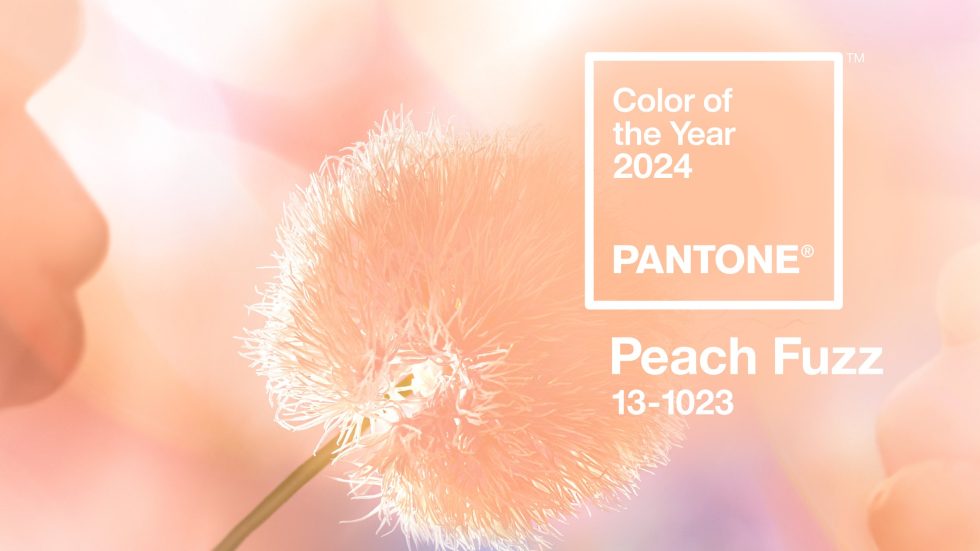
Pantone Colour of the Year 2024: Peach Fuzz
Alongside the rest of the design industry, at Versital we have been patiently waiting in anticipation for the colour of the year to be announced by Pantone . This year certainly lived up to expectations!
Peach Fuzz has been developed “to bring a sense of kindness and tenderness whilst also encouraging a message of community and collaboration”.
A Fresh Approach From Pantone
Peach Fuzz embodies a fresh approach to a new softness that is developing in design sector, be it interior design, fashion or product. It’s aim is to encourage individuals to gain a sense of comfort and sanctuary within the colour.
We have seen a shift in the design schemes coming through to us towards tranquillity and a sense of calm. Peach Fuzz truly embraces the trend of creating comfort and a place to flourish within your space.

Re-framing Your Life
Peach Fuzz is a shade that encourages self-expression and exploration in aligning our values with what we focus on within our daily lives. Pantone’s focus is to emphasise the importance of spending time with loved ones as well as taking a moment of time to ourselves.
Encouraging coming together with others and embracing ourselves is the message entangled with this colour.
Embrace Pantone’s colour of the Year with these Marble finishes
Versital has some perfect marbles to use that complement the colour of the year, with more to come. Watch this space!
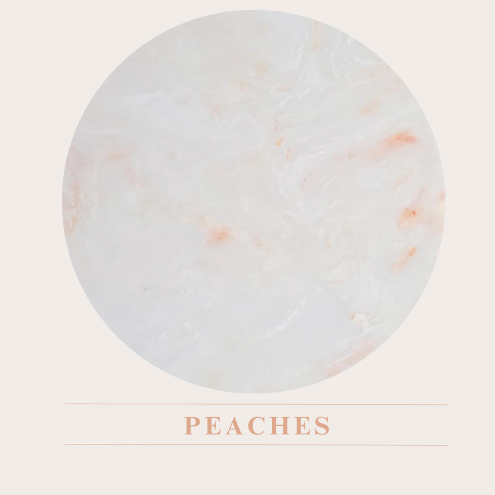
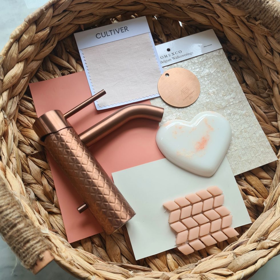
Peaches
Inspired by Peach Fuzz, this whimsical and soft peach marble is the perfect addition to any project. The perfect addition to Instagram worthy interiors, and an extremely forgiving finish making it perfect for hospitality projects.
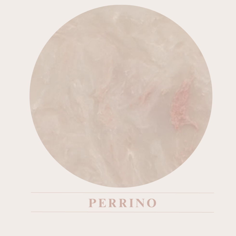
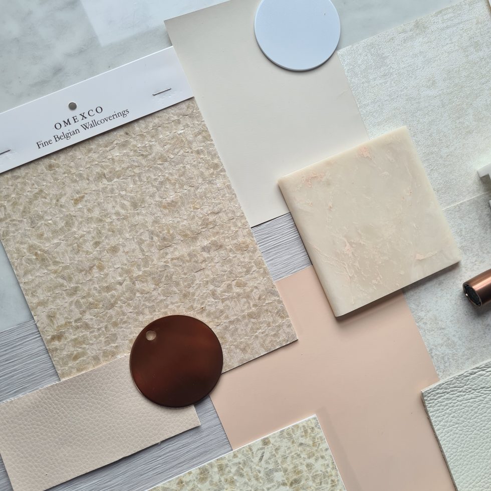
Perrino
A light cream marble with subtle pink veins and flecks that add a softness to any project. Perfect paired with other neutrals, or a great backdrop with a strong scheme.
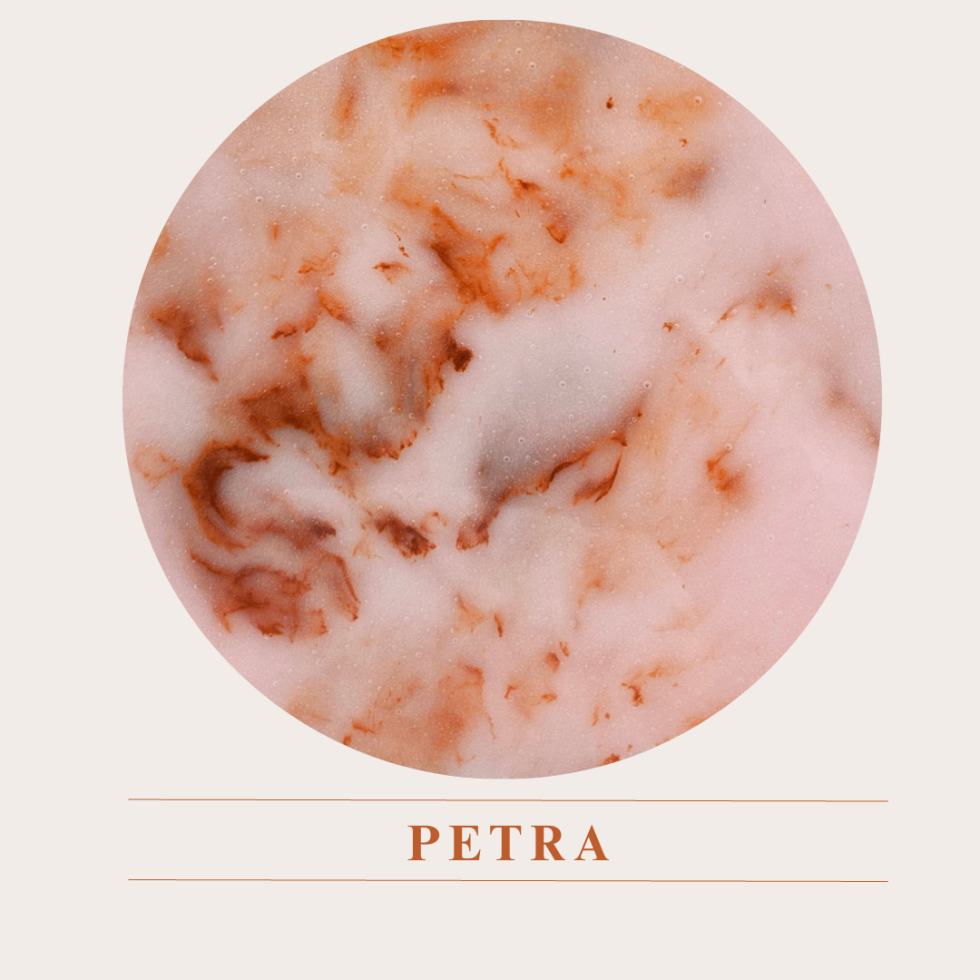
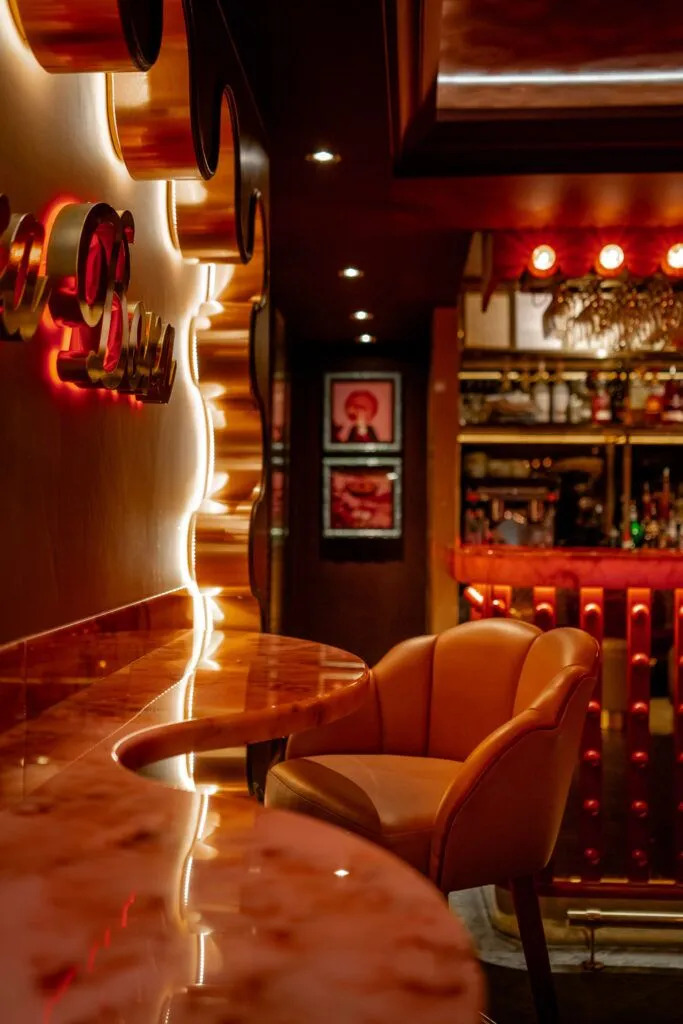
Petra
New for 2023 and exclusive to Versital, Petra is a soft pink background with strong veins of orange and brick red.
Home Decor
For the home projects, opt for Versital in the bathroom by using it for vanity tops or even bathroom wall panels. If you’re brave enough go all out with Petra, but for a more subtle nod Perrino is ideal. Pair with whites, darks or for real impact clash with blues and greens.
Peaches in Hospitality
Make the most of the peachy hues that are taking over the design world and implement fun complimentary shades of peach alongside soft cream tones that allow the peach to come to life. Embrace the peachy interiors and allow the peach to pop in your design projects.
Petra in Hospitality
Stand out from the crowd with the bold Petra, as seen in retro inspired bar, Bora Bora designed by the team at Studio Two. Making a unique statement with a bespoke curved bar top.
Perrino in Hospitality
If neutral tones are more your taste, Perrino is a perfect option for a creating a calming sanctuary with hints of peach. Complimented by Omexco shell wallpaper which brings together the luxury feel created by the marble and the colour. Opt to use Perrino on the bar top and match with the table tops.
“We are always excited to see what Pantone’s latest colour forecast will be, and this year certainly did not disappoint”
Gemma Stockberger – Versital
Get In touch!
For help and advise for how to use Versital to realise your design vision, get in touch today. We can introduce you to a design advisor and supply you an estimate directly. Speak to us today on 01204 380780 or send us a contact form.
Get In Touch!