Tag Archive: pantone colour of the year

  1. Pantone Colour of the Year 2024: Peach Fuzz

    Leave a Comment

    Alongside the rest of the design industry, at Versital we have been patiently waiting in anticipation for the colour of the year to be announced by Pantone . This year certainly lived up to expectations!

    Peach Fuzz has been developed “to bring a sense of kindness and tenderness whilst also encouraging a message of community and collaboration”.
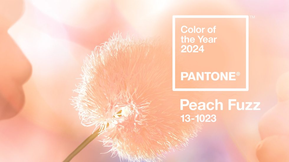
    Pantone colour of the year 2024 Peach Fuzz

    A Fresh Approach From Pantone

    Peach Fuzz embodies a fresh approach to a new softness that is developing in design sector, be it interior design, fashion or product. It’s aim is to encourage individuals to gain a sense of comfort and sanctuary within the colour.

    We have seen a shift in the design schemes coming through to us towards tranquillity and a sense of calm. Peach Fuzz truly embraces the trend of creating comfort and a place to flourish within your space.

    Pantone colour of the year 2024 Peach Fuzz
    Photo Credit – Pantone

    Re-framing Your Life

    Peach Fuzz is a shade that encourages self-expression and exploration in aligning our values with what we focus on within our daily lives. Pantone’s focus is to emphasise the importance of spending time with loved ones as well as taking a moment of time to ourselves.

    Encouraging coming together with others and embracing ourselves is the message entangled with this colour.

    Embrace Pantone’s colour of the Year with these Marble finishes

    Versital has some perfect marbles to use that complement the colour of the year, with more to come. Watch this space!

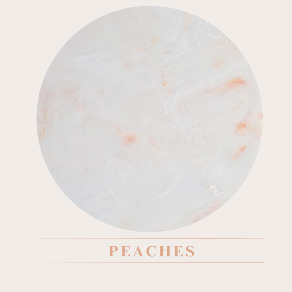
    Peaches

    Inspired by Peach Fuzz, this whimsical and soft peach marble is the perfect addition to any project. The perfect addition to Instagram worthy interiors, and an extremely forgiving finish making it perfect for hospitality projects.
    places insta content
    places insta content

    Perrino

    A light cream marble with subtle pink veins and flecks that add a softness to any project. Perfect paired with other neutrals, or a great backdrop with a strong scheme.
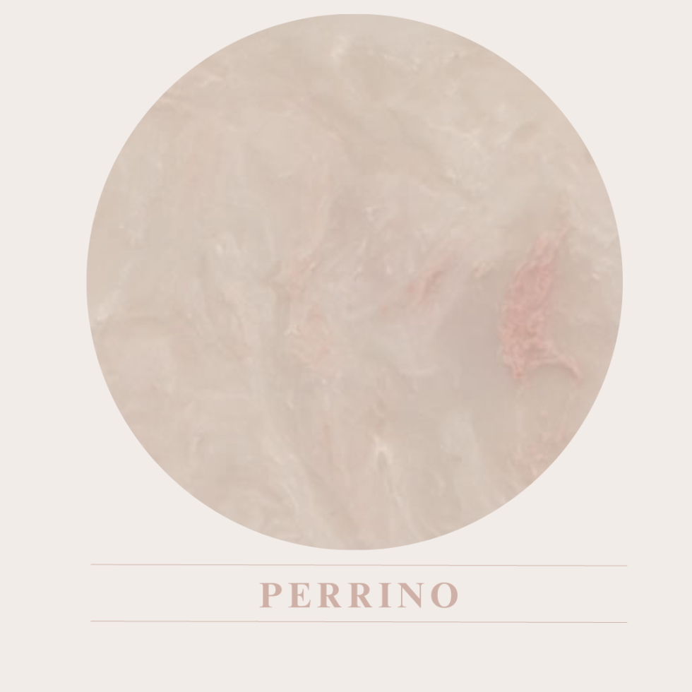
    Perrino colour card.A light cream marble with subtle pink veins and flecks.

    Petra

    New for 2023 and exclusive to Versital, Petra is a soft pink background with strong veins of orange and brick red.
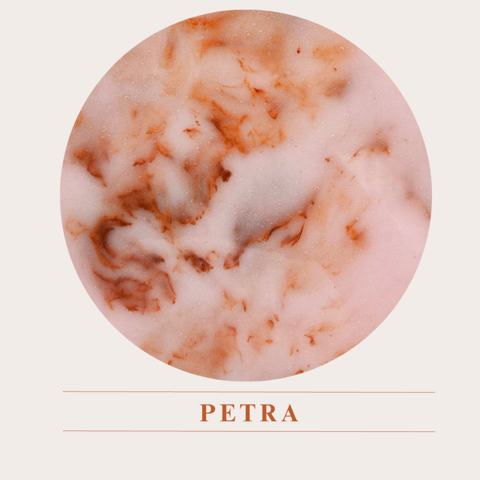
    Inspiration from the Rose City of Petra A soft pink background with strong veins of orange and brick red.

    Home Decor

    For the home projects, opt for Versital in the bathroom by using it for vanity tops or even bathroom wall panels.  If you’re brave enough go all out with Petra, but for a more subtle nod Perrino is ideal.  Pair with whites, darks or for real impact clash with blues and greens.

    Peaches in Hospitality

    Make the most of the peachy hues that are taking over the design world and implement fun complimentary shades of peach alongside soft cream tones that allow the peach to come to life. Embrace the peachy interiors and allow the peach to pop in your design projects.
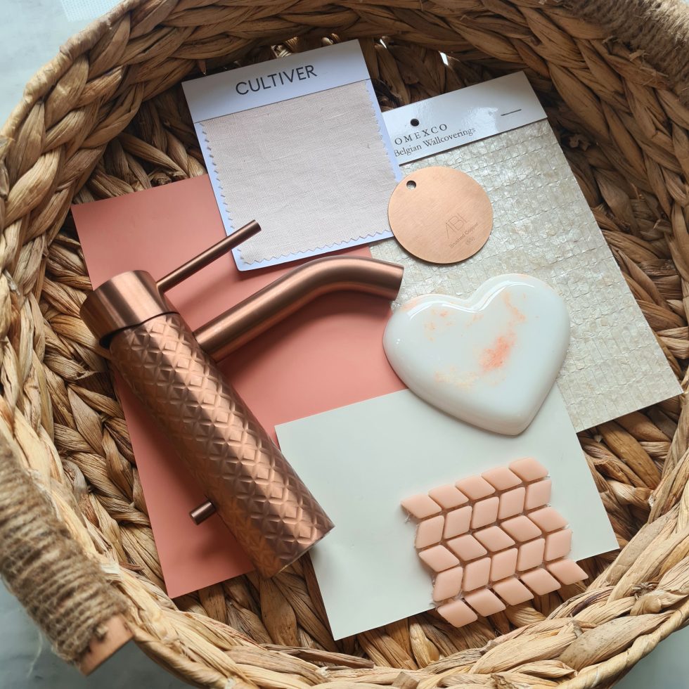
    Peach heart 2
    Peach heart 2

    Petra in Hospitality

    Stand out from the crowd with the bold Petra, as seen in retro inspired bar, Bora Bora designed by the team at Studio Two. Making a unique statement with a bespoke curved bar top.
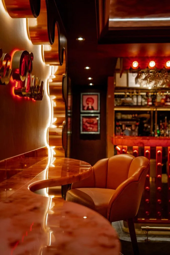
    Bora Bora red and pink retro inspired bar with pink marble table tops and bar

    Perrino in Hospitality

    If neutral tones are more your taste, Perrino is a perfect option for a creating a calming sanctuary with hints of peach. Complimented by Omexco shell wallpaper which brings together the luxury feel created by the marble and the colour. Opt to use Perrino on the bar top and match with the table tops.
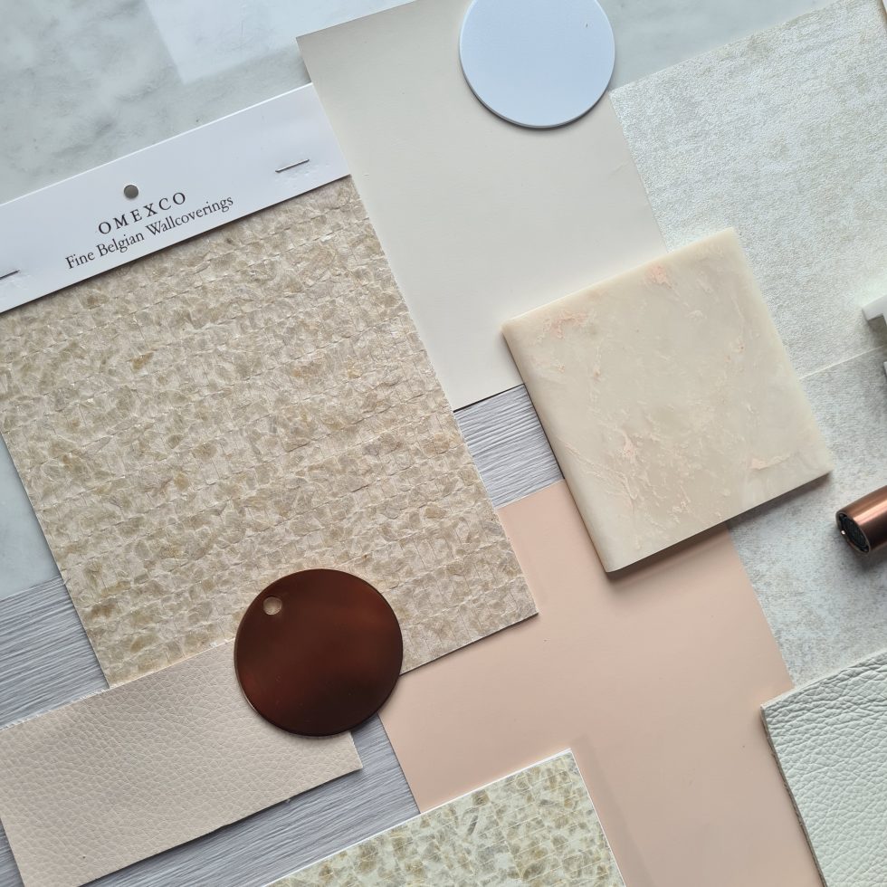
    Neutrals and pink inspired moodboard

    “We are always excited to see what Pantone’s latest colour forecast will be, and this year certainly did not disappoint”

    Gemma Stockberger – Versital

    Get In touch!

    For help and advise for how to use Versital to realise your design vision, get in touch today. We can introduce you to a design advisor and supply you an estimate directly. Speak to us today on 01204 380780 or send us a contact form.

    Get In Touch!
  2. Pantone’s Colour of the Year 2022 : Very Peri

    Leave a Comment

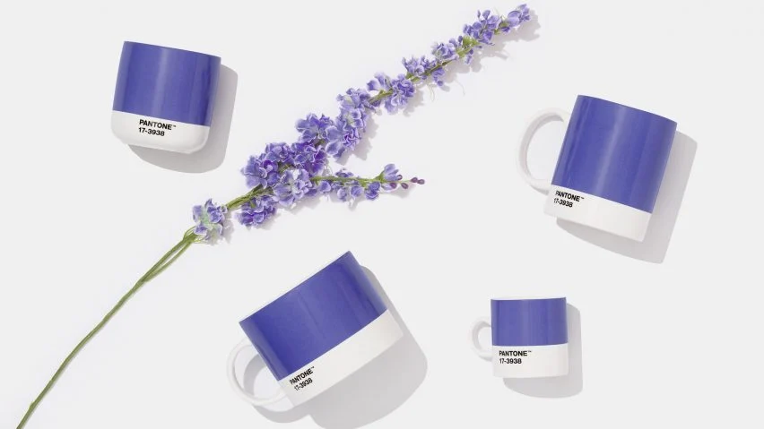
    Every year the design industry wait in anticipation for the colour of year to be announced by Pantone, and this year feels very special indeed. Not only has it been heralded as the ‘It’ colour for 2022, but Very Peri is in fact a brand new colour created by Pantone for the first time ever in the history of its Colour of the Year forecasts.

    A happy feeling Lavender purple shown here on pantone branded mugs

    Transformative Times

    ‘We are living in transformative times,’ say Pantone. ‘Very Peri is a symbol of the global zeitgeist of the moment and the transition we are going through. As we emerge from an intense period of isolation, our notions and standards are changing, and our physical and digital lives have merged in new ways.’

    Encouraging personal inventiveness and creativity, Pantone describe Very Peri as a ‘dynamic periwinkle blue hue with a vivifying violet red undertone’.

    Promoting Happiness and Positivity

    Very Peri has been described as ‘the happiest and warmest of all the blue hues’. With the challenges faced by everyone over the past couple of years, we think that anything that promotes happiness and positivity can only be a good thing.  

    In the home, Very Peri add fun and a sense of lightness to spaces, working well with both dark and light colour palettes. This versatile shade is suited to different materials, textures and finishes.

    Versital has two ideal options that work perfectly with Pantone’s Very Peri:

    Penthouse

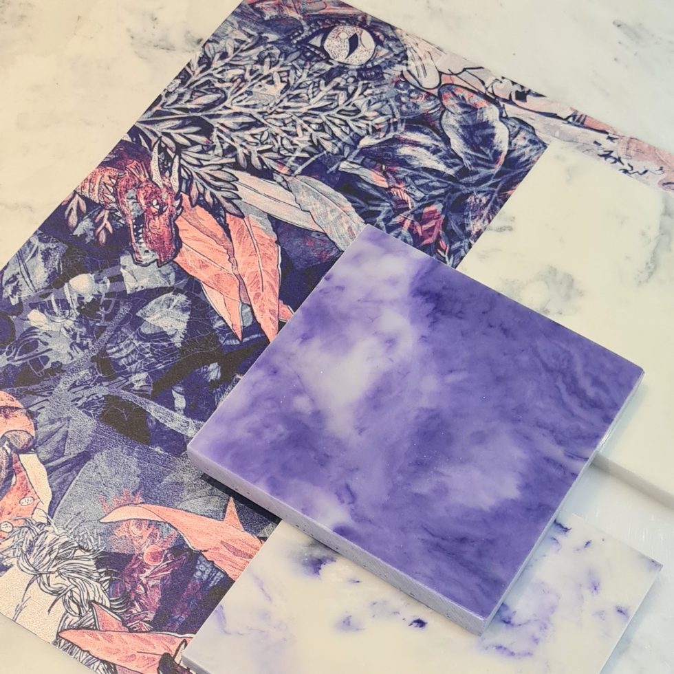
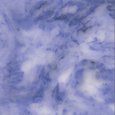
    A beautiful bold lavender marble with swirls of veins throughout.

    Lavender purple marble with clouds of veins Very Peri Pantone

    Perlato Penthouse

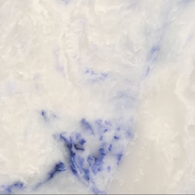
    A subtle off white classic marble with a nod to Veri Peri with veins of lavender swirled throughout.

    Off white marble with Purple veins

    Home Decor

    For the home opt for Versital in the bathroom by using it for vanity tops or even bathroom wall panels.  If you’re brave enough go all out with Penthouse, but for a more subtle nod Perlato Penthouse is ideal.  Pair with whites, darks or for real impact clash with Pinks and Mustards.

    Veri Peri in Hospitality

    Go bold with beautiful prints from Bobo 1325 with prints like ‘That’s the tea’ and ‘Blackmountain Brecon’. Available in both wallpapers and fabrics they make a real statement to walls or seating and soft furnishings.

    Rich lavender marble with swirls of purple and white veins - Very Perii Pantone

    Pair with bar tops and table tops from Versital to complete the look.

    A World of unprecedented change

    “As we move into a world of unprecedented change, the selection of PANTONE 17-3938 Very Peri brings a novel perspective and vision of the trusted and beloved blue colour family.

    Encompassing the qualities of the blues, yet at the same time possessing a violet-red undertone, Very Peri displays a spritely, joyous attitude and dynamic presence that encourages courageous creativity and imaginative expression.”

    Executive Director Pantone Color Institute – Leatrice Eiseman
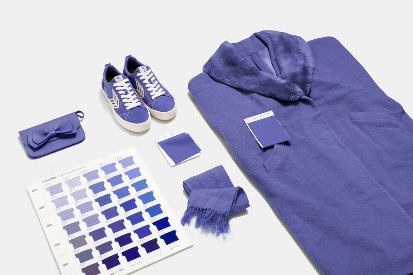
    The new lavender purple from Pantone Very Peri for a range of products including paint, clothes and fabrics

    “We are always excited to see what Pantone’s latest colour forecast will be, and this year certainly did not disappoint”

    Gemma Stockberger – Versital

    “Pantone has been influencing multiple industries for 23 years, including fashion, home furnishings, hospitality and graphic design. With this latest offering we can see why!”

    Please get in touch to order samples, or for more information on any of our products or colour ranges. sales@versital.co.uk T: 01204 380780.

  3. Pantone Colour Of The Year 2018 – Ultra Violet

    Leave a Comment

    Pantone Colour Of The Year 2018 – Ultra Violet

    Each year a new colour dominates the design world and that’s all thanks to the power of Pantone and their chosen colour of the year; where Pantone lead, designers across all industries from fashion to interiors follow. For 2018, Pantone’s colour of the year is a striking shade of purple named Ultra Violet so get set to embrace Pantone 18-3838 (its official colour code) – we promise you’ll be seeing it everywhere!

    Why Ultra Violet?

    The authority on colour, Pantone’s selection is about so much more than setting seasonal trends. Since announcing their first colour of the year back in 2000, the experts who make this all important decision take note of what the world needs, and for 2018, their purpose is to inspire each of us to invent and imagine.

    Pantone describe Ultra Violet as ‘a dramatically provocative and thoughtful purple shade’ and it certainly creates a captivating feeling with its mysterious and enigmatic tones. It feels a little bit futuristic too and Leatrice Eiseman, Executive Director of Pantone states ‘Intuitive Ultra Violet lights the way for what is yet to come.’


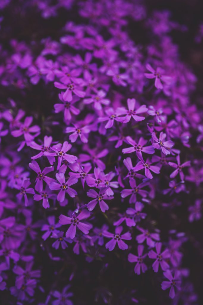
    Photo by Kaboompics .com from Pexels
    Photo by Kaboompics .com from Pexels

    How to use the colour

    From paint and prints, to fabric and furniture, the influence of Pantone’s colour of the year is apparent across all aspects of design. Here at Versital it’s no exception; our exciting range of 100% waterproof surfaces will effortlessly incorporate the trending tones of Ultra Violet into your space.

    Surfaces inspired by Pantone for Home Interiors

    If you’re decorating at home, adding one of our handmade surfaces as a vanity top or shower panel will look smart, sophisticated and bring the inviting allure of a hotel suite to your own bathroom. Try the understated and luxurious marble effect of Perlato Penthouse for a subtle nod to the trend.

    Perlato Penthouse marble from Versital inspired by pantone's colour of the year 2018 Ultra Violet

    If you’re designing for a commercial space, opt for our unique made-to-order surfaces as bar or table tops. In a wide range of finishes they’re perfect for bars and restaurants, or as decorative panels in salons and hotels. For instant interior impact, choose Penthouse or Shiraz, both of which have been inspired by Pantone’s colour of the year.

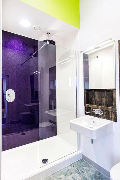
    Contemporary bathroom design at Royal Quays Marina Newcastle

    View Versital’s full range of Ultra Violet inspired surfaces via our exclusive colour palette, or if you’d like to find out more information about our surfaces, please call the team on 01204380780, or email sales@versital.co.uk